
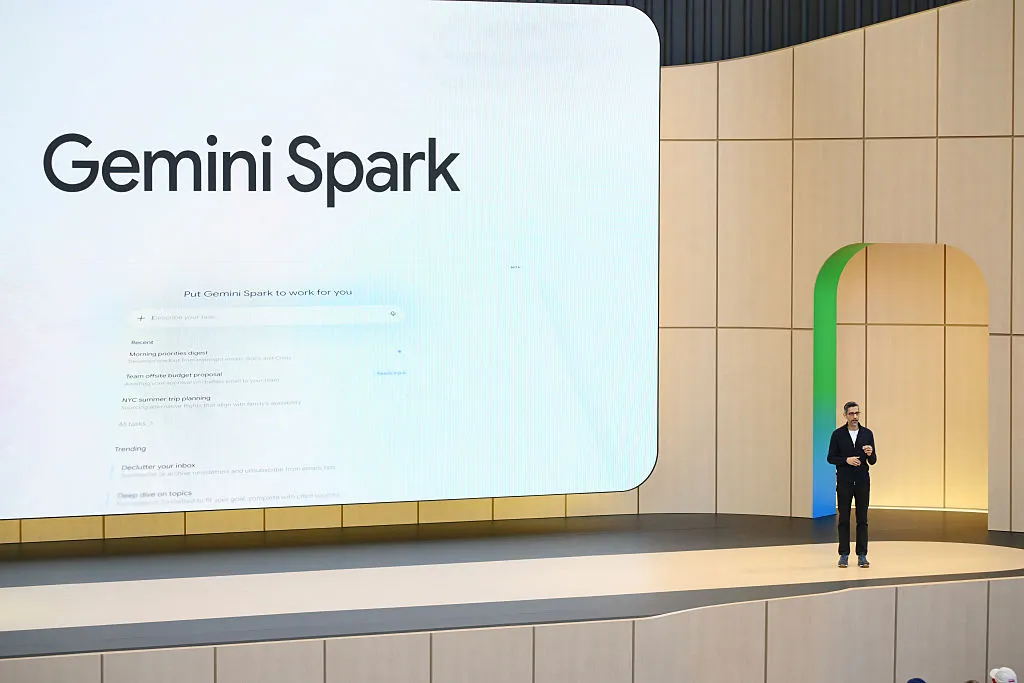
Google gets something right in its Wednesday announcement about new Gemini Live voice features when it says, “You shouldn’t have to guess whether a task requires Spark, a Daily Brief, or a quick inbox search.” Google means that as a promise — that the updated Gemini app can handle a variety of tasks via voice commands. But there’s a ridiculousness here: Google has given every Gemini AI feature under the sun its own branding, which undercuts that very message.
In the Gemini app, users can switch between chat, Spark, and Daily Brief — three separate features, each with its own icon and place in the app’s navigation. This clutters up what could otherwise be a more straightforward consumer experience, and it suggests that Gemini is still struggling to find a killer feature.
Take Daily Brief, for example. The feature comes across as the kind of thing an AI engineer, not an everyday user, would think is clever. It’s essentially an AI-enabled agenda that offers “proactive, personalized updates” using data pulled from Google’s apps, like Gmail and Calendar. In practice, though, the Brief can’t tell the difference between information that’s urgent or actionable and unsolicited nudges to follow up on other things — like prompting you to continue research you started in the chatbot, or worse, resurfacing your prior Google searches.
That second part doesn’t feel useful; it feels creepy. So what if I had been researching college scholarships or animal rescues on Google? That doesn’t mean I want an AI tapping me on the shoulder about them later.
Spark has the opposite problem. It’s one of the more useful aspects of Gemini’s app — an AI agent that can take action on your behalf — but Google has packaged it as its own standalone brand, which it doesn’t need to be. Sure, internally, Google engineers may want to be on the Spark team, and that’s fine — but a mainstream AI app user definitely does not need to think about which “side” of the AI app they need to be in for a given task. They should just be able to type their request, and the AI figures out how to handle it, spinning up an agent if the task calls for one.
In fairness, the problem isn’t limited to Gemini. The AI industry at large seems to expose its internal architecture directly to consumers rather than hiding it behind a simpler interface.
Today, people have to think about whether they want to “chat” with Anthropic’s Claude or “Cowork” with its help. (Until this week, those two modes inside the Claude app didn’t even share a memory of past conversations.) ChatGPT is the same, requiring you to swap between “Chat” and “Work.” This is the kind of engineering-minded design that makes engaging with AI feel unnatural. Consumers are being asked to learn the brand names for what are essentially interaction modes or surfaces, powered by a company’s AI model.
This may be why Apple’s somewhat anticlimactic approach to Siri could ultimately win over consumers. iPhone and Apple device owners don’t have to change any of their existing behavior to take advantage of it. Apple simply makes the apps and features that people already use — like Spotlight Search, the Photos app, the iPhone’s Camera, and Siri voice requests — smarter without asking users to learn a new interface.
This same principle may explain the rise of text-based AI services, where users simply text a chatbot — like Poke, Ollie, Lindy, Orchid, Lucas, Folk, Tomo, Instinct, or others — and the assistant just does what’s asked.
Text messaging is a clean and simple, well-understood user interface, and it doesn’t require extra mental effort to figure out which feature or product inside a larger app you’re supposed to use.
As a16z investment partner Justine Moore recently wrote, “People don’t want to open an app every time they need help – they want a contact they can text like a friend. And the gold standard is iMessage.”
When you purchase through links in our articles, we may earn a small commission. This doesn’t affect our editorial independence.
{content}
Source:{feed_title}
When you purchase through links in our articles, we may earn a small commission. This doesn’t affect our editorial independence.
Key Takeaways
- Google’s Gemini platform, despite promising simplicity, is hindered by excessive internal branding of features like “Spark” and “Daily Brief,” creating a cluttered and confusing user experience.
- The broader AI industry often exposes its underlying architecture to consumers, forcing users to learn specific interaction modes (e.g., “Chat” vs. “Cowork”) rather than offering intuitive, unified intelligence.
- The future of mainstream AI adoption likely lies in invisible integration (like Apple’s approach) or familiar, low-friction interfaces (like text messaging), prioritizing user ease over complex feature branding.
The Paradox of AI Simplicity: Google Gemini’s Branding Bloat
Google, in its recent announcement of new Gemini Live voice features, articulated a commendable vision: “You shouldn’t have to guess whether a task requires Spark, a Daily Brief, or a quick inbox search.” This statement, intended as a promise of seamless interaction, inadvertently highlights a critical flaw plaguing not just Gemini, but much of the burgeoning AI industry: an obsession with internal branding that actively undercuts user experience.
Google Gemini, designed as an all-encompassing AI assistant, forces users into a perplexing labyrinth of branded functionalities. Within the app, users must consciously navigate between “Chat,” “Spark,” and “Daily Brief,” each relegated to its own icon and distinct position in the navigation. This fragmented approach clutters the interface and creates unnecessary cognitive load, screaming that Gemini is still searching for its definitive killer feature rather than confidently presenting a unified intelligence.
Daily Brief: Clever in Theory, Creepy in Practice
Consider “Daily Brief,” a feature that exemplifies an engineer-first, user-second design philosophy. Pitched as an AI-enabled agenda offering “proactive, personalized updates,” it pulls data from Google’s ecosystem like Gmail and Calendar. In reality, the Brief struggles to discern actionable, urgent information from unsolicited, often irrelevant, nudges. It might prompt you to continue research initiated in the chatbot or, more disturbingly, resurface prior Google searches. This isn’t helpful; it’s an intrusive reminder of past digital footprints, making the AI feel less like an assistant and more like a digital stalker. Why should an AI tap me on the shoulder about old college scholarship research or animal rescue inquiries? Such interactions feel less useful and more overtly creepy.
Spark: A Useful Tool Trapped by Unnecessary Branding
Then there’s “Spark,” which suffers from the opposite problem. Spark is arguably one of the more genuinely useful components of Gemini – an AI agent capable of taking proactive action on a user’s behalf. Yet, Google has insisted on packaging it as its own standalone brand. While internal teams might rally around the “Spark team” moniker, the average consumer doesn’t, and shouldn’t, need to understand Google’s internal organizational structure to interact with an AI. A mainstream AI application should simply allow users to articulate their request, and the underlying intelligence should seamlessly determine whether to spin up an agent, initiate a search, or provide a chat response. The user shouldn’t be forced to think about which “side” of the AI app they need to be in for a given task.
An Industry-Wide Affliction: Exposing the AI’s Inner Workings
The issue extends far beyond Google. The broader AI industry seems to be making a collective mistake: exposing its internal architectural components directly to consumers instead of elegantly abstracting them behind a simpler, more intuitive interface. Users of Anthropic’s Claude, for instance, are asked to distinguish between “chatting” and “coworking” with the AI. Until recently, these modes didn’t even share memory of past conversations, creating a disjointed user experience. Similarly, ChatGPT requires users to consciously swap between “Chat” and “Work” modes.
This “engineering-minded design” forces consumers to learn product names for what are essentially interaction modes or internal functions of an AI model. It fundamentally makes engaging with AI feel unnatural, demanding users to adapt to the AI’s internal logic rather than the AI adapting to human intuition. This cognitive overhead is a significant barrier to mainstream adoption, transforming what should be a seamless experience into a series of conscious decisions about which “brand” of AI to use.
The Path to Simplicity: Apple’s Integration and Text-Based AI
Perhaps this explains why Apple’s seemingly understated approach to integrating AI into its ecosystem could ultimately prevail. Apple isn’t asking iPhone and Apple device owners to learn new interfaces or switch between branded AI features. Instead, it’s making the tools and apps people already use — Spotlight Search, the Photos app, the Camera, and Siri voice commands — inherently smarter. This seamless enhancement of existing behaviors, without demanding new cognitive models or branded features, minimizes friction and maximizes utility. Apple’s AI isn’t a separate destination; it’s an invisible enhancement to the user’s existing digital life.
A similar principle underpins the rising popularity of text-based AI services. Platforms like Poke, Ollie, Lindy, Orchid, Lucas, Folk, Tomo, and Instinct allow users to simply text a chatbot, and the assistant executes the request. Text messaging is a universally understood, clean, and simple user interface. It requires no extra mental effort to navigate complex app structures or decipher which branded feature is appropriate for a task. As a16z investment partner Justine Moore eloquently put it, “People don’t want to open an app every time they need help – they want a contact they can text like a friend. And the gold standard is iMessage.” This highlights a deep user desire for AI that is approachable, integrated, and feels like a natural extension of their communication habits.
Bottom Line
The future of AI for the masses isn’t about more brands or complex interfaces; it’s about invisible intelligence that seamlessly integrates into daily workflows and existing behaviors. While companies like Google are making strides in AI capabilities, their current approach to user experience, characterized by excessive internal branding and exposed architectural complexities, creates unnecessary friction. True innovation in AI will come not from inventing more branded modes, but from hiding the complexity, making AI an intuitive, ever-present assistant that anticipates needs and acts discreetly, much like a trusted friend, rather than a confusing collection of specialized tools.